
Addict, a local sports store, has spent 20 years feeding the Antwerp community's addiction to running. It was the brainchild of Patrick and was one of the first city sports stores in the area. Armed with two stores and a team of running enthusiasts, Addict has been a cornerstone in Antwerp’s athletic scene, fueling its passion for the sport.
Positioning
Brand story
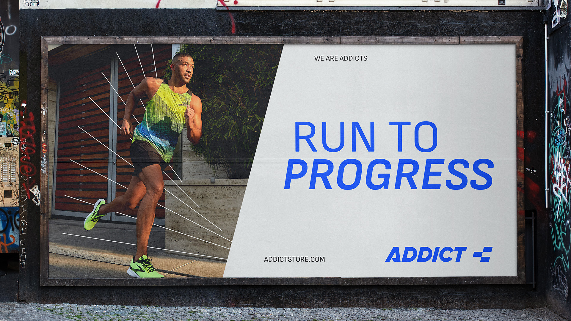
Baseline
Logo design
Visual identity
Print Advertising
Digital Advertising
Store Interior
Despite their established presence and passionate team, Addict grappled with articulating what sets them apart from the competition. With a strong desire to refresh their brand image and broaden their appeal to younger audiences, Addict sought out an agency that could drive their brand evolution.
Through our research and workshop, we uncovered Addict’s unique strength: a passionate team of runners that knows running inside and out. As a specialist running store, Addict offers products and advice you won’t find in general sports shops—helping runners elevate their performance.
More than a retail space, Addict is a community hub where athletes shape their style through a premium athleisure range. With over 20 years in Antwerp, the brand is a trusted name in the running community.
Their team constantly explores new trends, offering tailored gear and coaching to support every runner’s journey. This spirit is captured in the tagline "Run to Progress"—a reflection of Addict’s belief in continuous improvement, whether in running, personal growth, or brand evolution.
As a part of the brand evolution, we modernized Addict's visual identity. Maintaining references to the original logo, the new design integrates a sporty vibe with a more contemporary blue shade and streamlined lines. Despite the modernization, the identity retains a touch of familiarity for their existing customer base, ensuring a smooth transition.

Our proprietary association tool highlighted the inherent power that resonates with the brand name "Addict". Recognizing this strength, we carefully calibrated our design approach to balance it with a lighter, more approachable identity, thus preventing it from coming off as overly dominant or intimidating.
During the design phase, we experimented with several variations, assessing their ability to spark the desired associations. The result was a well-balanced identity that seamlessly fused the minimalistic design elements with bold typography and vibrant colors, reflecting the brand's progressive ethos.


Addict is now poised with a revitalized identity that will ensure its relevance for years to come. With clear messaging that articulates their unique value propositions, Addict has a robust foundation to communicate effectively with their customers. Future steps include refurbishing the interior of the stores and upgrading the webshop.
Through these transformative efforts, Addict has positioned itself for growth, clearly demonstrating why we are the agency of choice for brands looking to modernize, redefine, and reach new heights.


